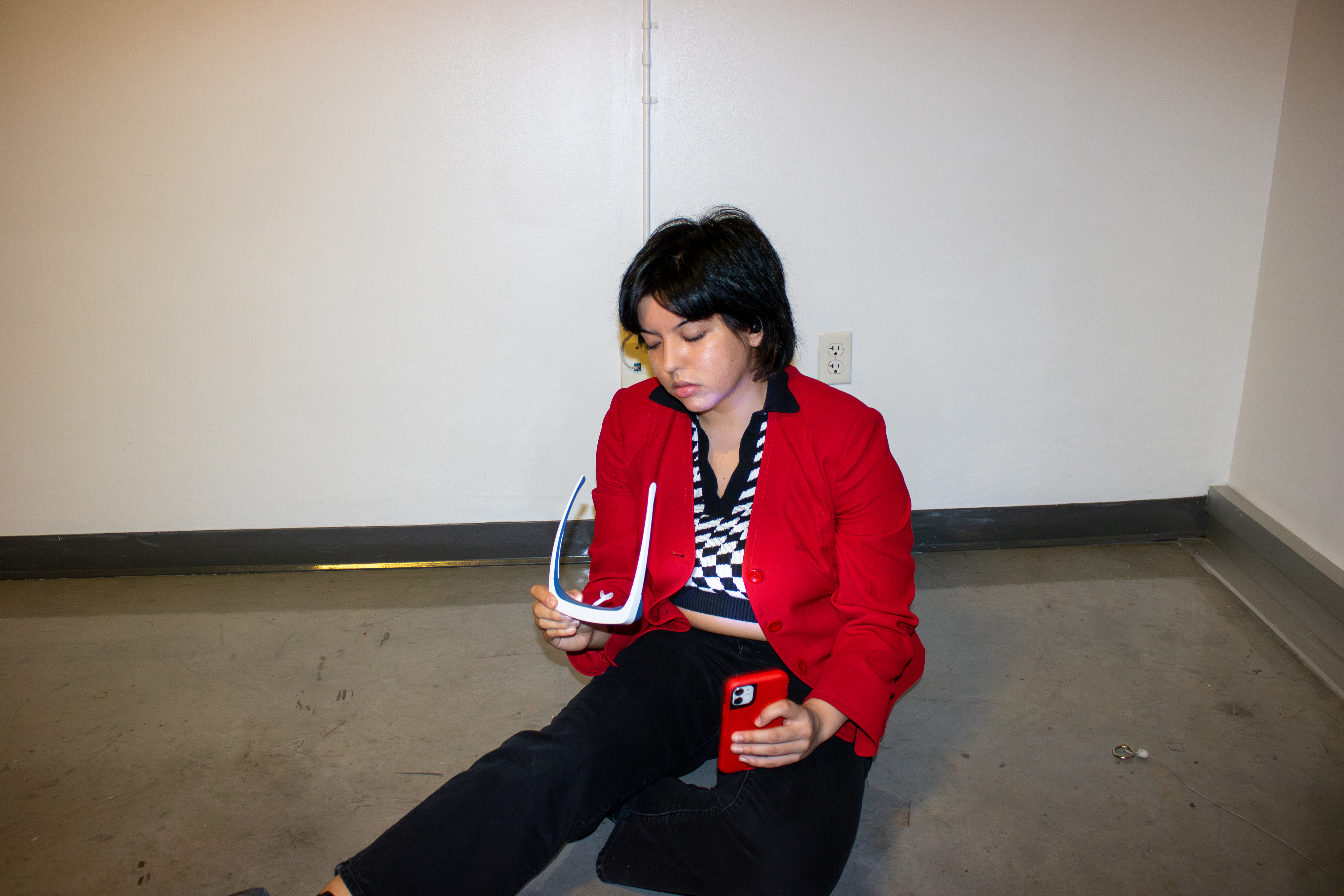
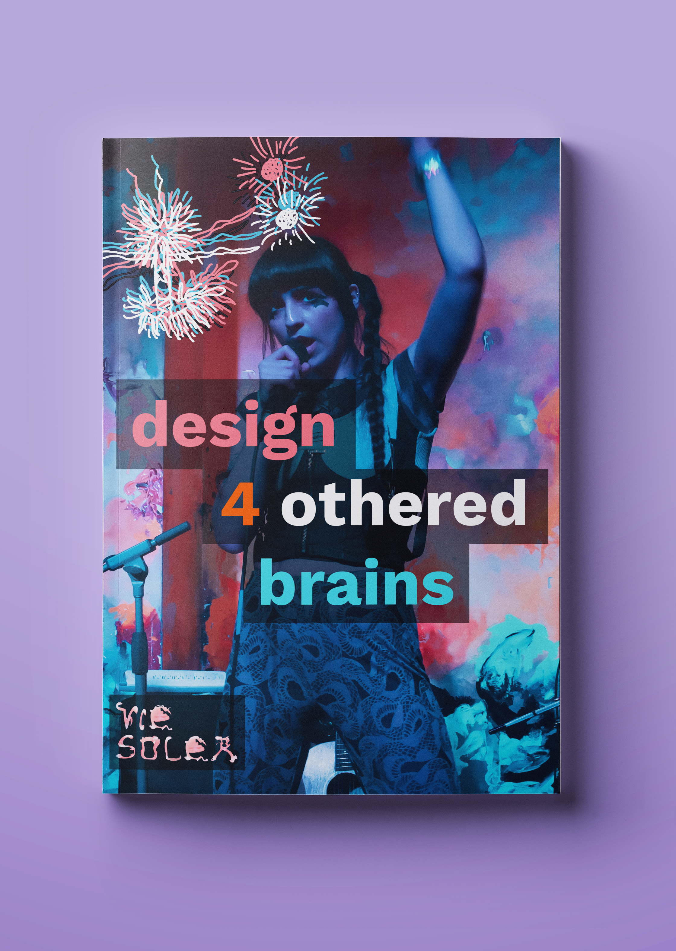
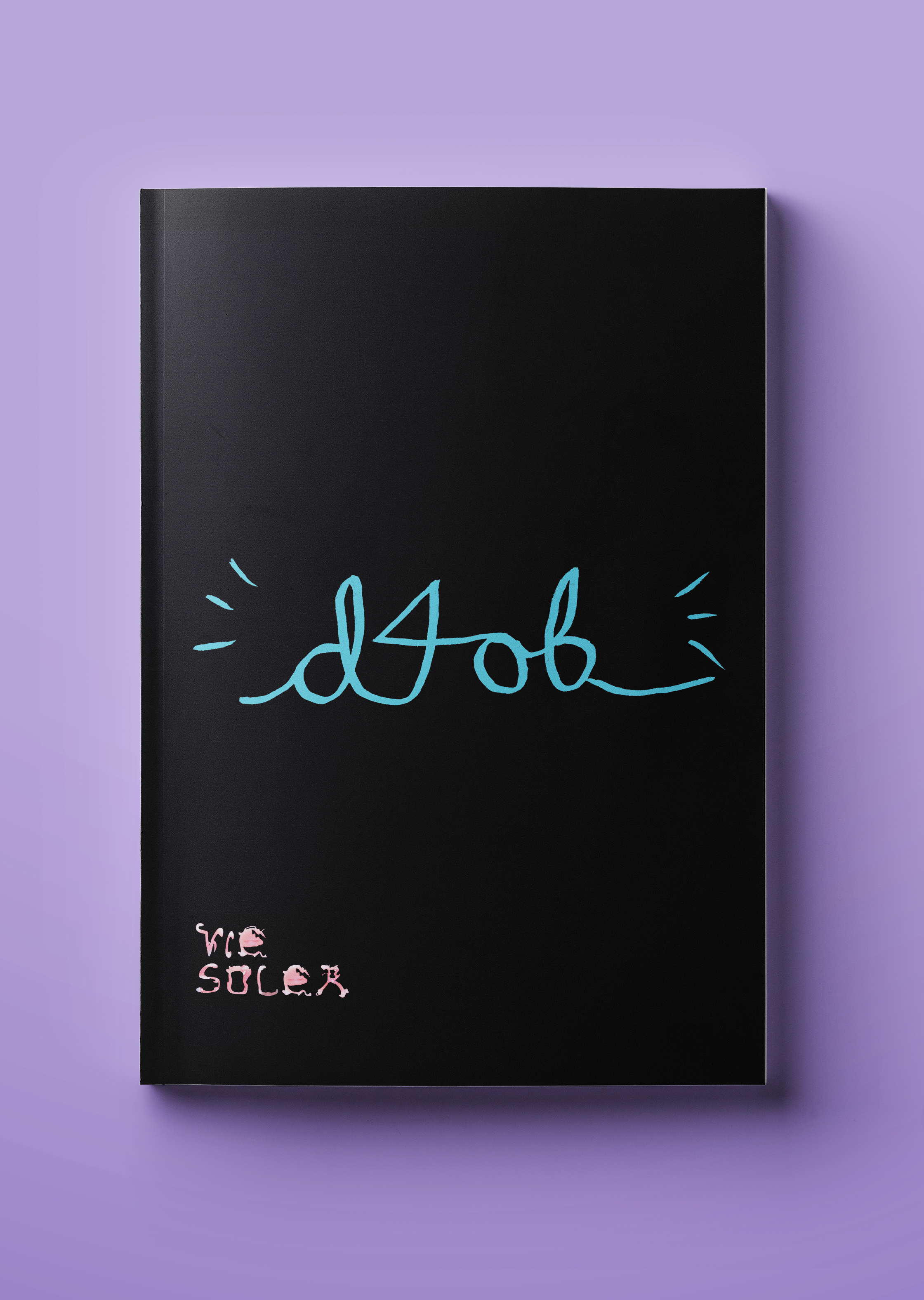
D4OB (Design 4 Othered Brains) - (2024)
BFA thesis, 200 pages
Publication, design system, graphic design, writing, bookmaking
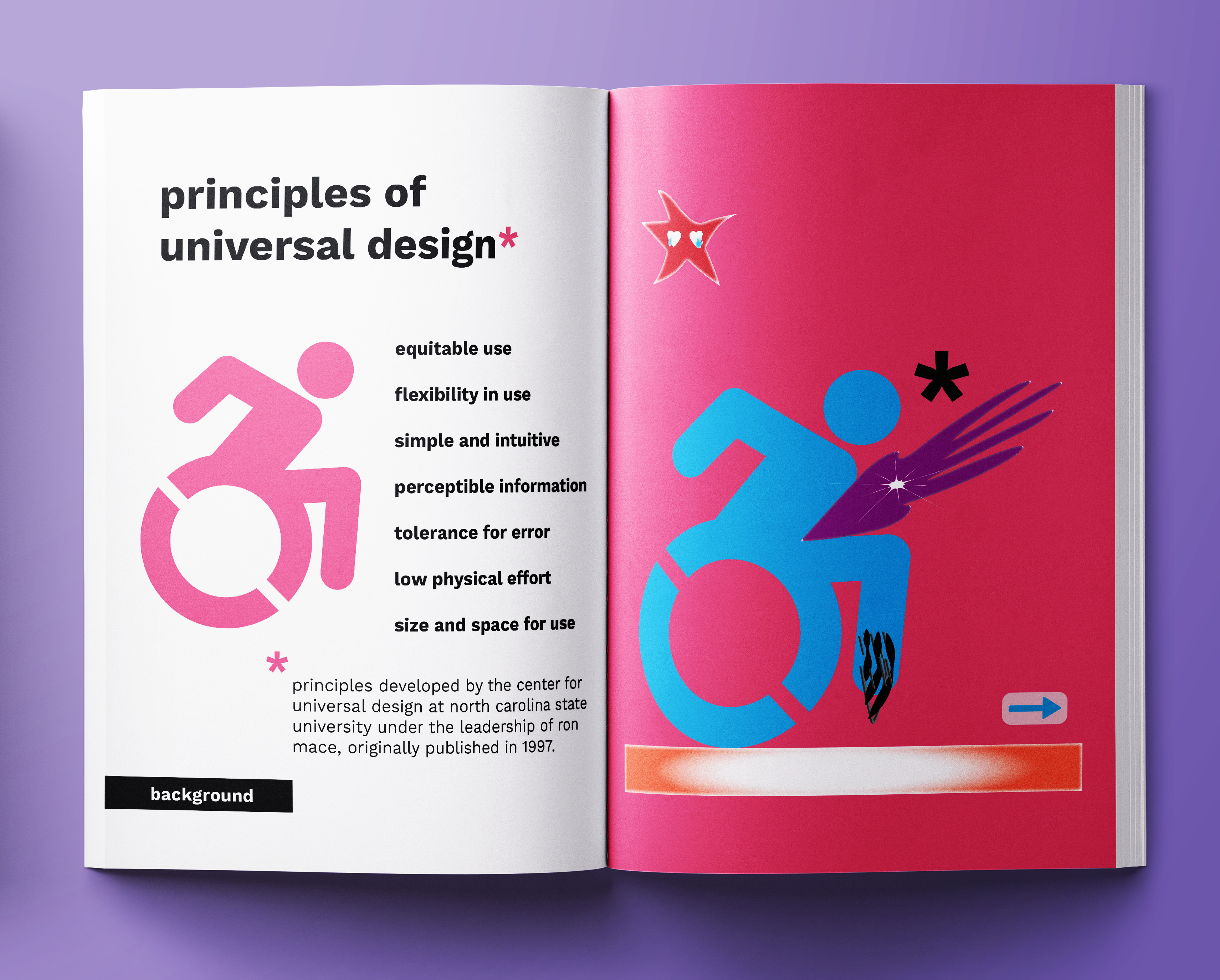
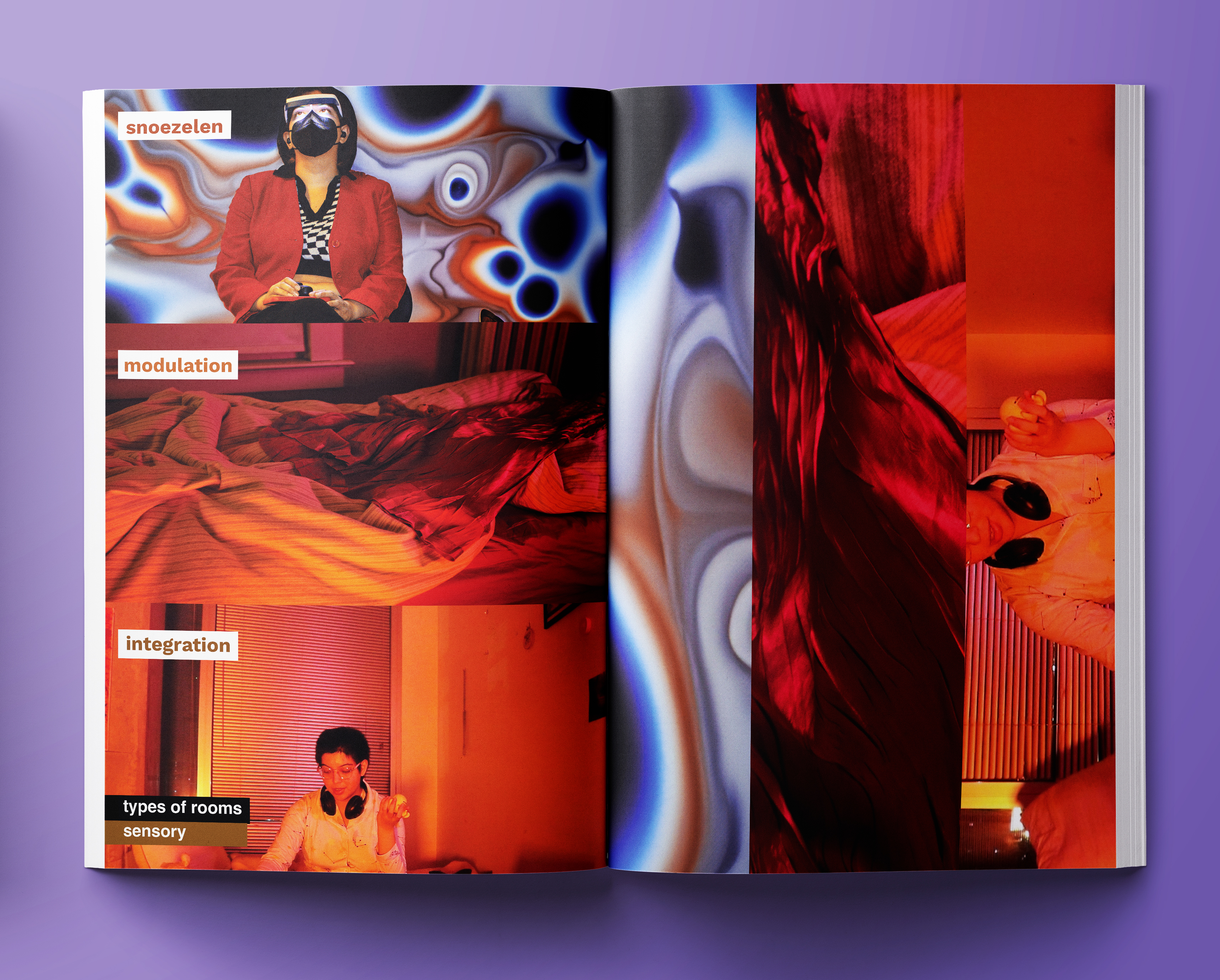
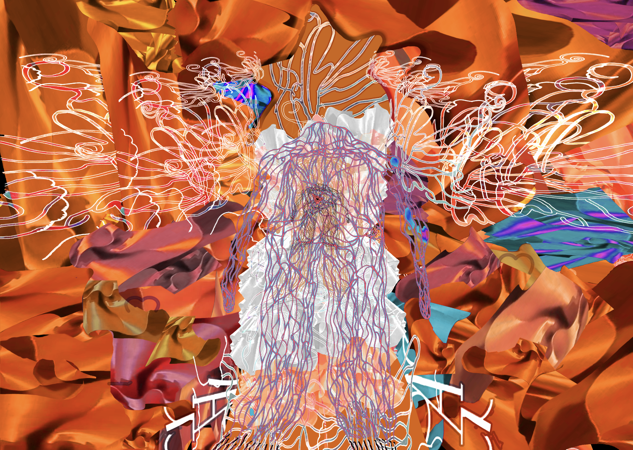
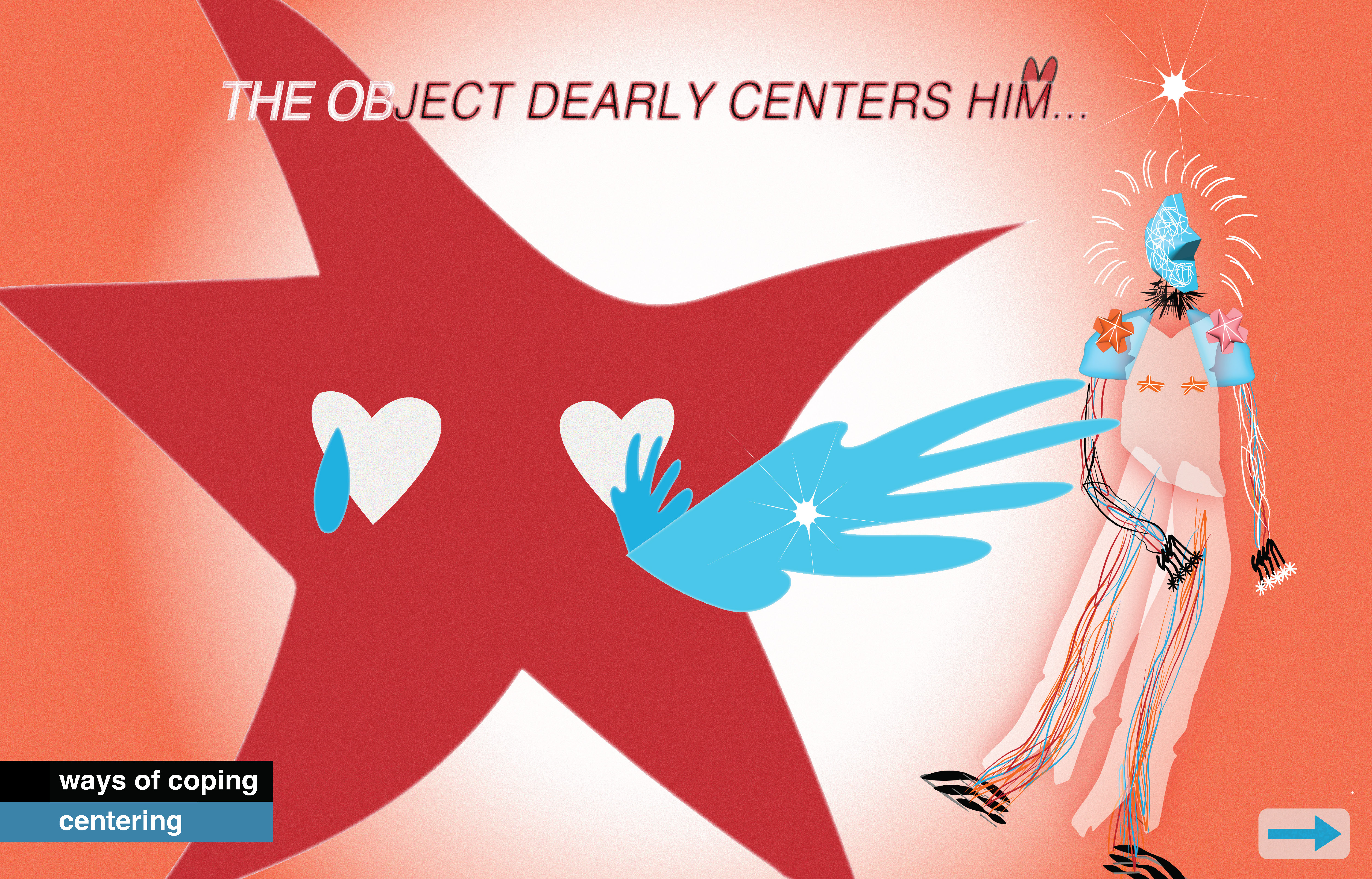
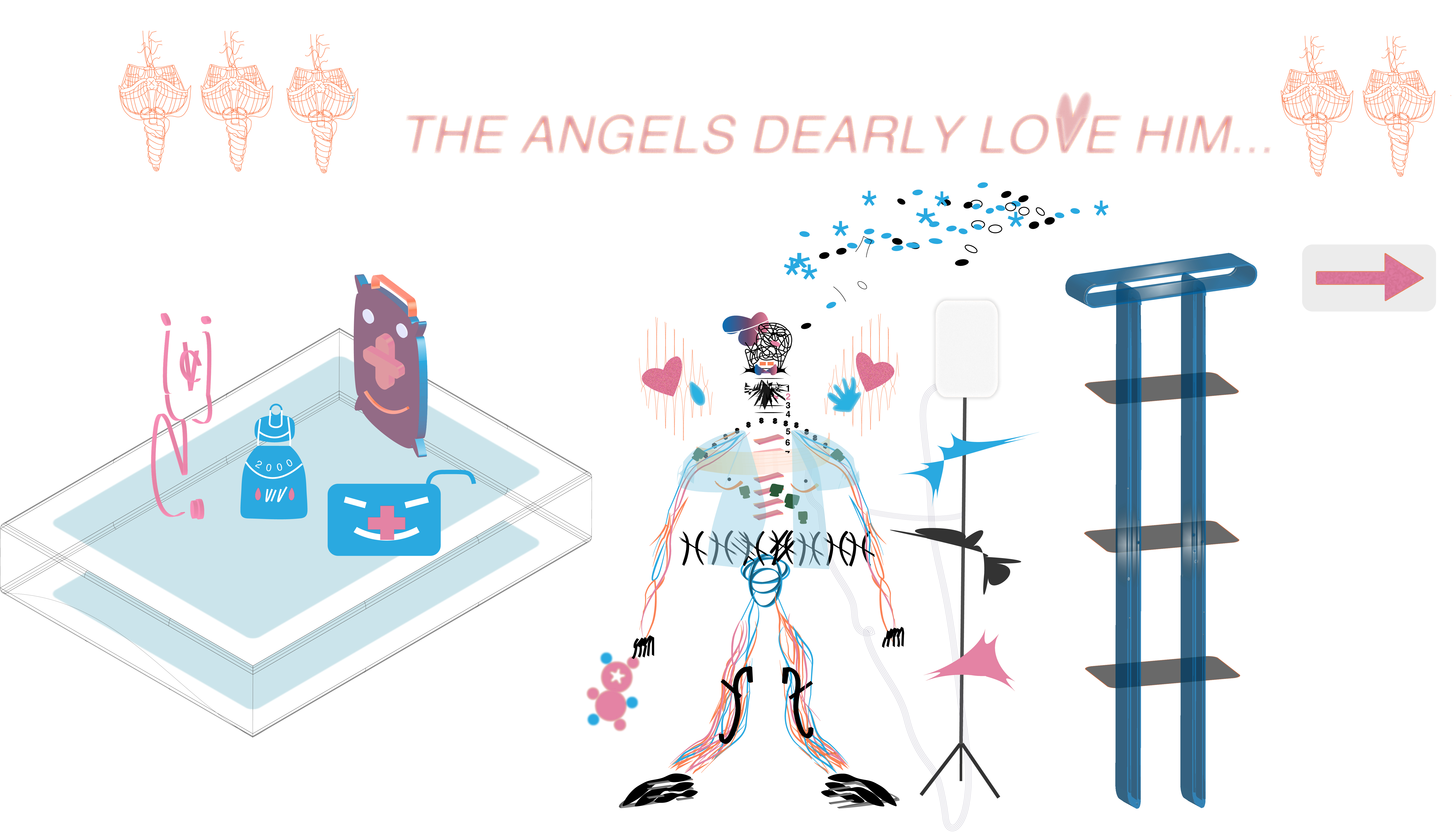
As a newer designer (and old-time) neurodivergent person, I am on a journey to learn, practice and better align myself with my needs and values- one of which is accessibilty. “Design 4 Othered Brains” (D4OB) is a dynamic introduction to neurodivergent accessibility through my own abstracted visuals. My intent is to introduce readers to creativity in accessibility, encourage desginers to consider this in their work, and for viewers to see my joy in this. I believe accessibility is an inherent and beautiful value.
accessibility info below

[Image description: A note on the accessibility of the book. This book focuses on neurodivergent accessibility, with a particular focus on creating safe spaces for the autistic and mentally ill. The author believes it's crucial to communicate existing strengths and knowledge rather than falsely claiming the book is accessible to all. They emphasize that disabled people are diverse and have varying needs; therefore, accessibility should not be the individual responsibility of disabled people. Accessibility should be built into systems and structures, not only for individual work but for all facets of life. The author acknowledges personal limitations in energy due to a timed project and aims for sustained accessibility through universal design, achieved through consistent effort. This was factored into production.]
[Image description: A note on the accessibility of the book for visually impaired readers.
The book prioritizes larger type and images. If a reader needs larger formatting, they can email viesolerone(at)gmail(dot)com. All chapter dividers, terms, and textual explanations are color-coded and meet 2025 WCAG color contrast guidelines. If raw text is desired, the reader can email viesolerone(at)gmail(dot) com.]

[Image description: For vectors on abstract designs, color contrast often meets WCAG guidelines, but this isn't absolute. There is no important text on abstract designs. For readers with visual sensitivity and/or photosensitive seizures, some designs can be experienced as mildly psychedelic, but there is no flashing (Since this is a physical book, potential “flashing” refers to stark contrast page-to-page colors or graphics).]
[Image description: Language is simplified, but at times uses more complex words necessary to communicate the depth of its content. Feel free to email viesoler(at)gmail(dot)com for simplified language.]
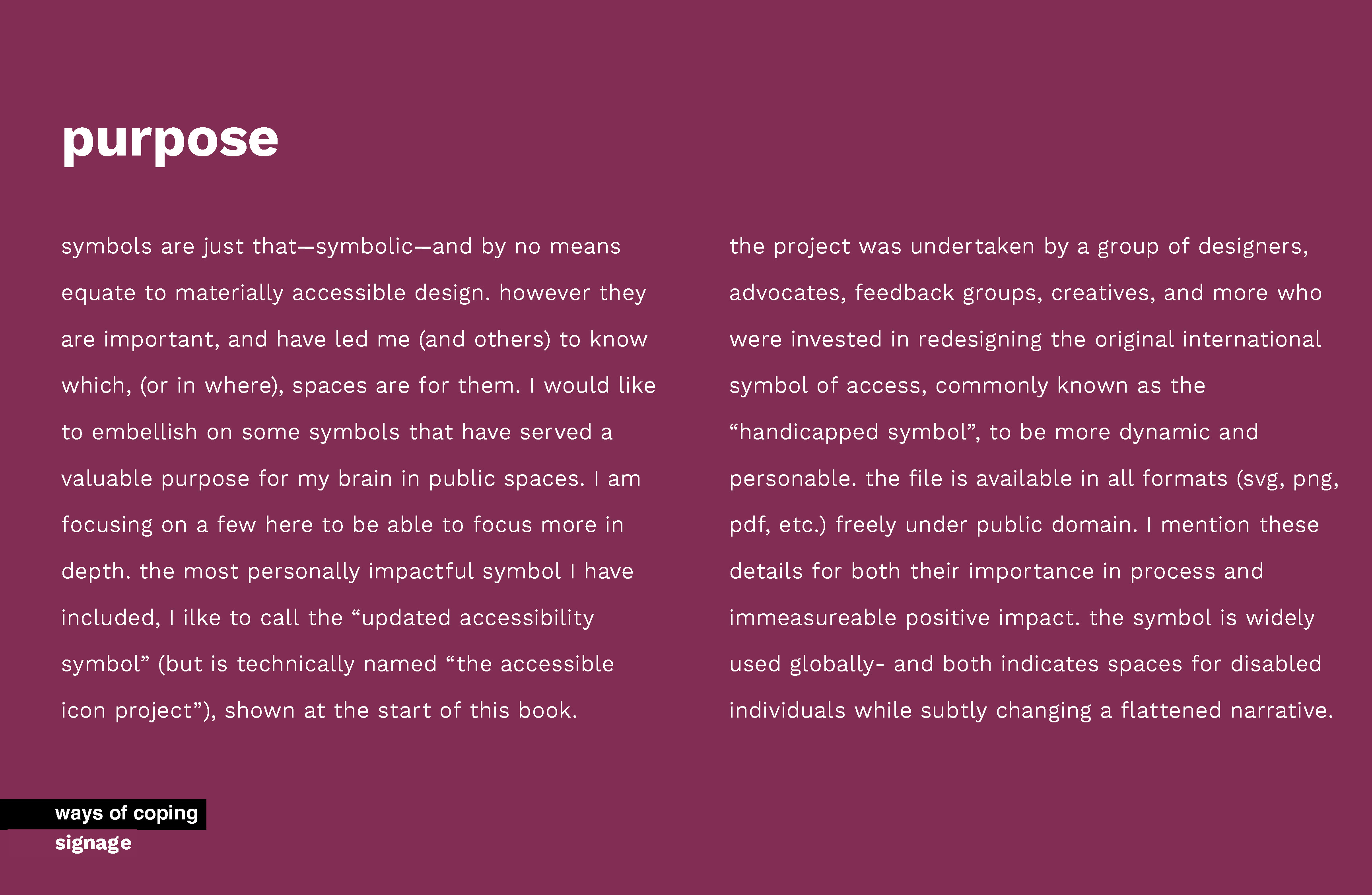
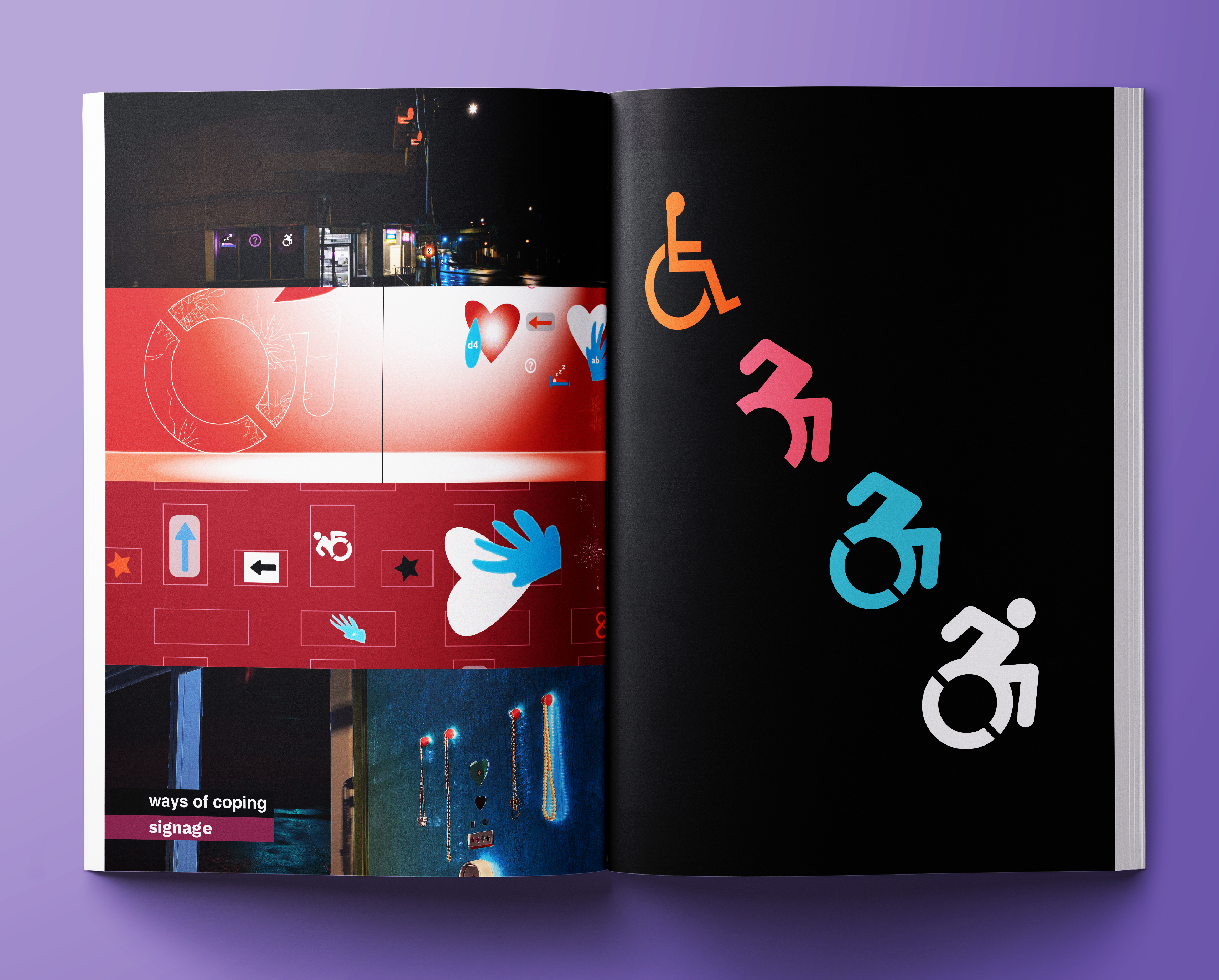
[Image description: Image has “ways of coping” and “signage” headers, and discusses accessibility symbols. An explanation that symbols do not equate truly accessible design, but are still important for identifying spaces for disabled people. Explanation highlighting a specific symbol, the accessible icon project and its positive impact.
Explanation that the accessible icon project was a collaborative effort involving designers, advocates, and many others. The revised symbol is more dynamic and personable, and author emphasizes this importance. Note that the redesign is freely available under public domain. Final paragraph connecting the symbol’s widespread adoption to a shift towards a more nuanced understanding of accessibility.
book preview in opt-in slideshow and images below
please note that I am in the process of providing image descriptions for the following images given my capacity. thank you for your patience.


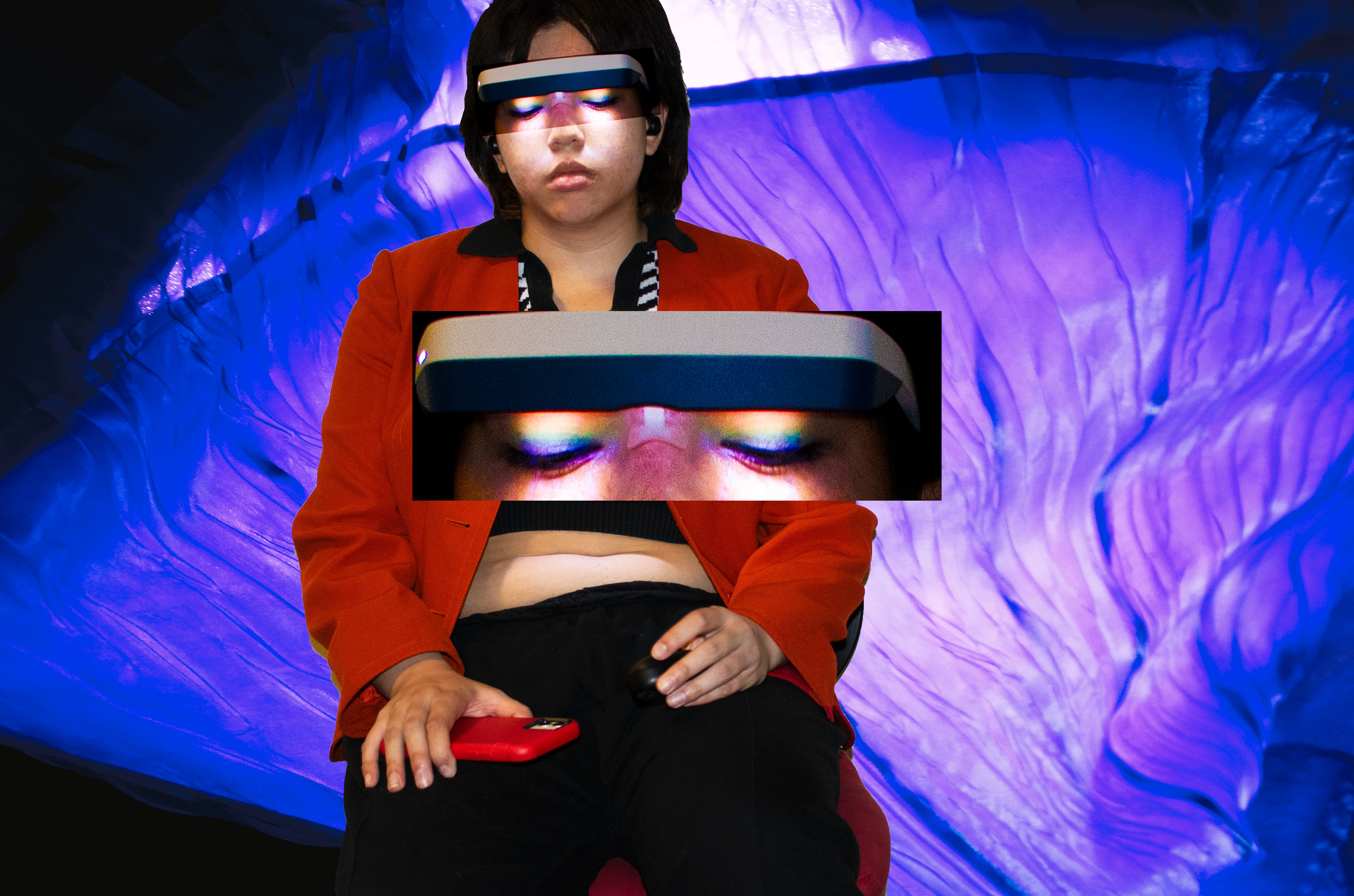
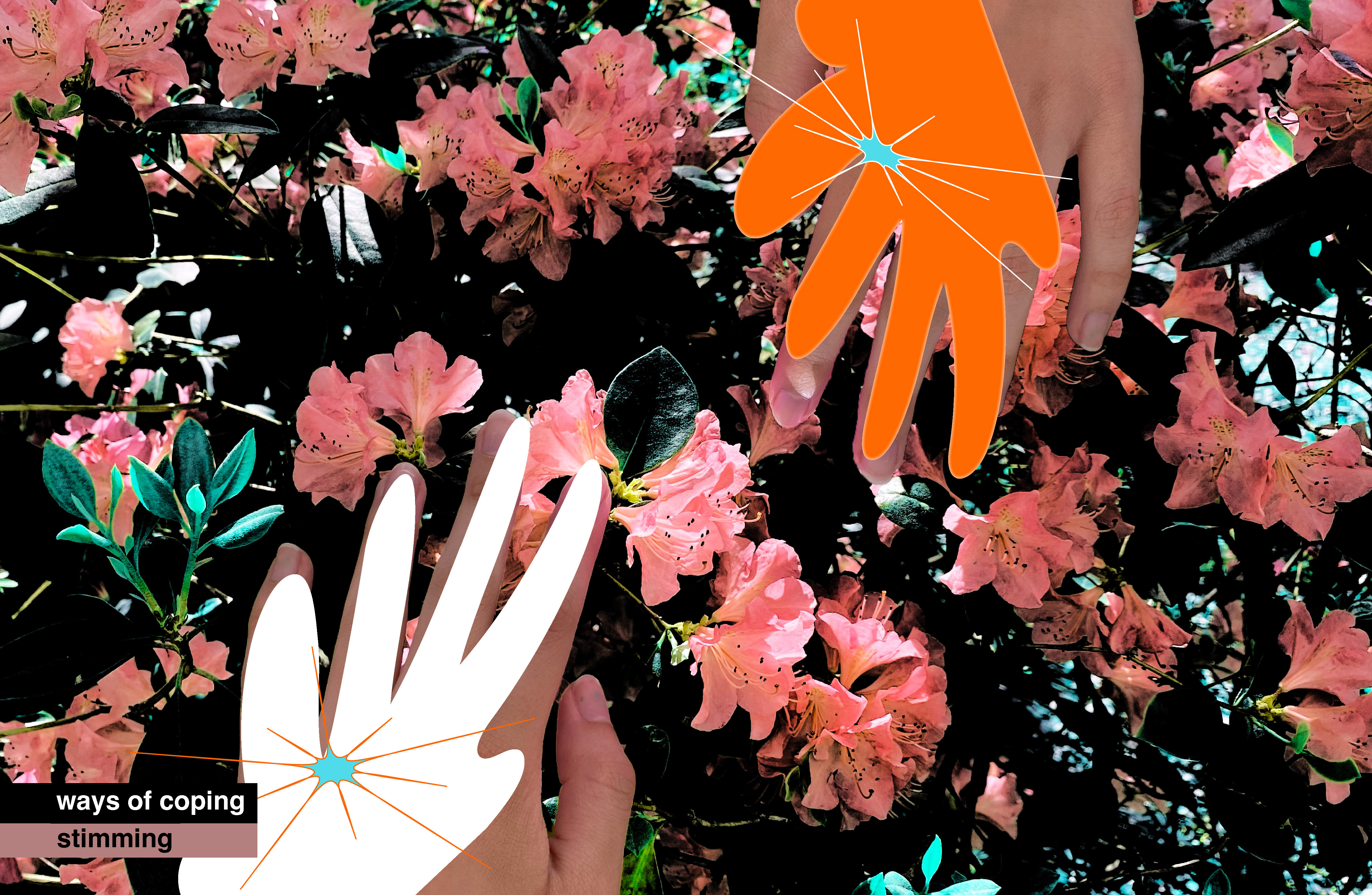
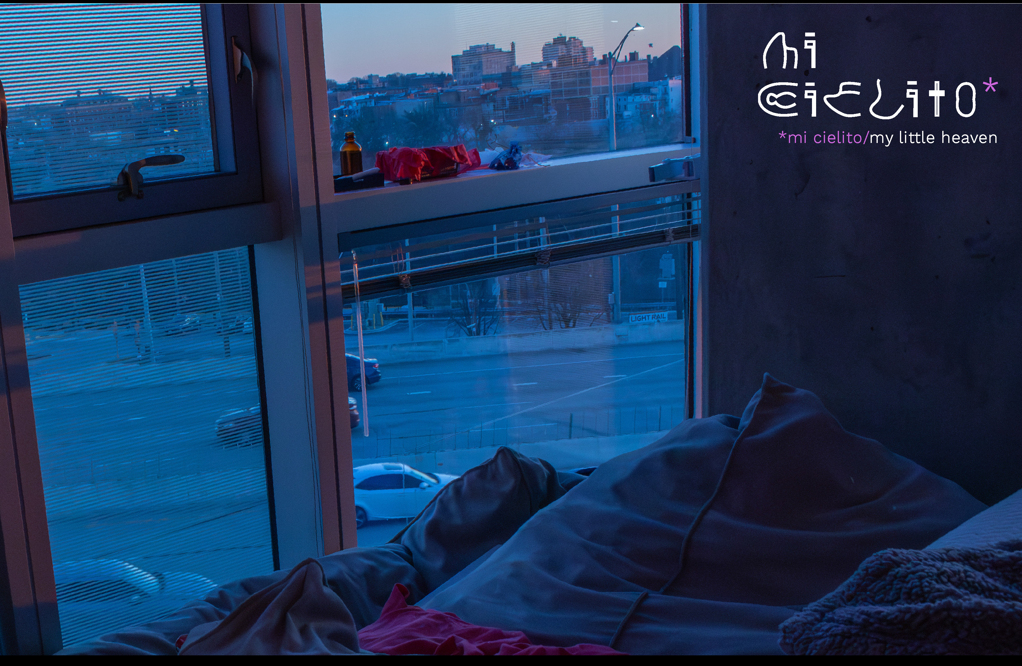
[Image description:

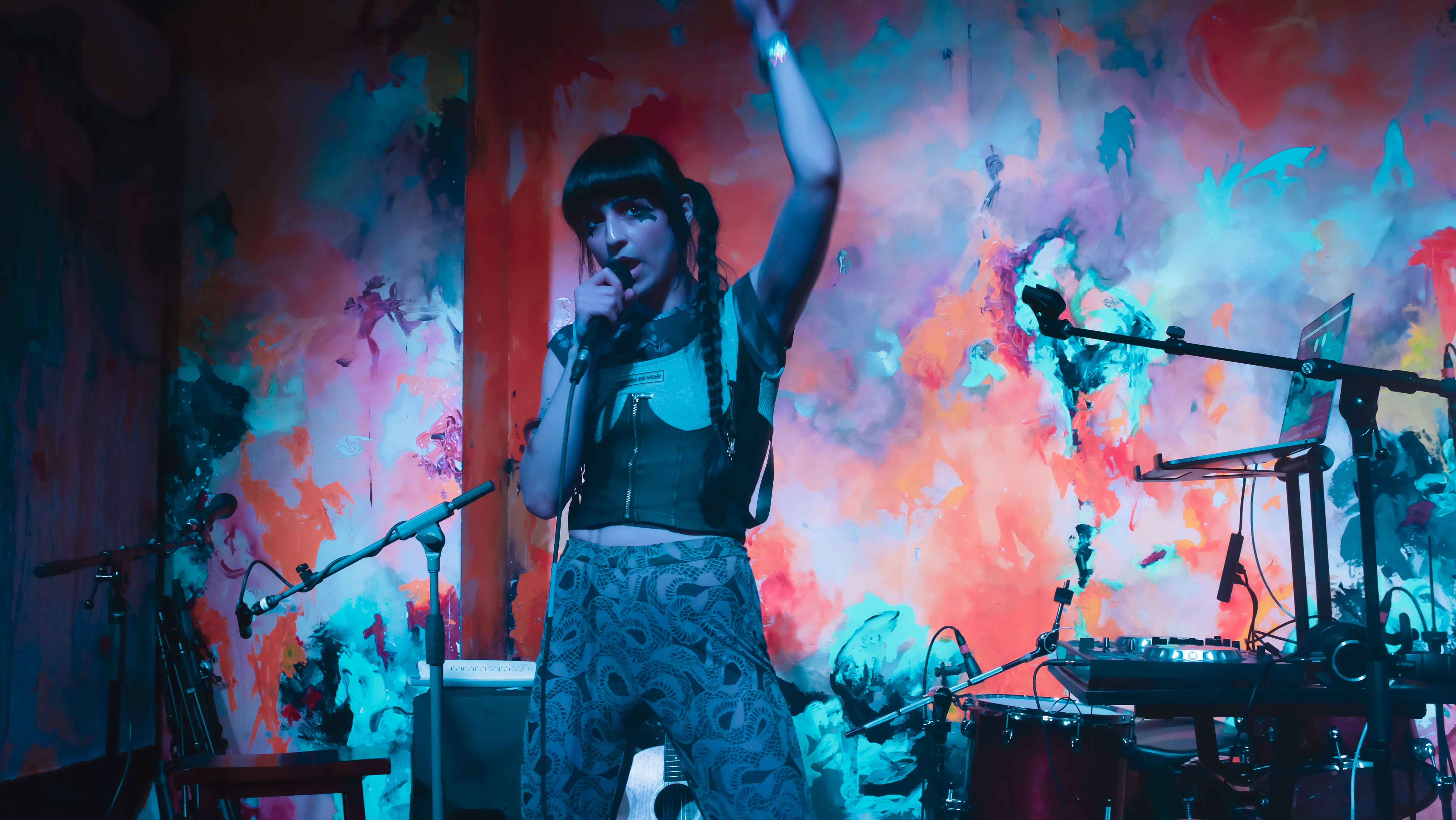



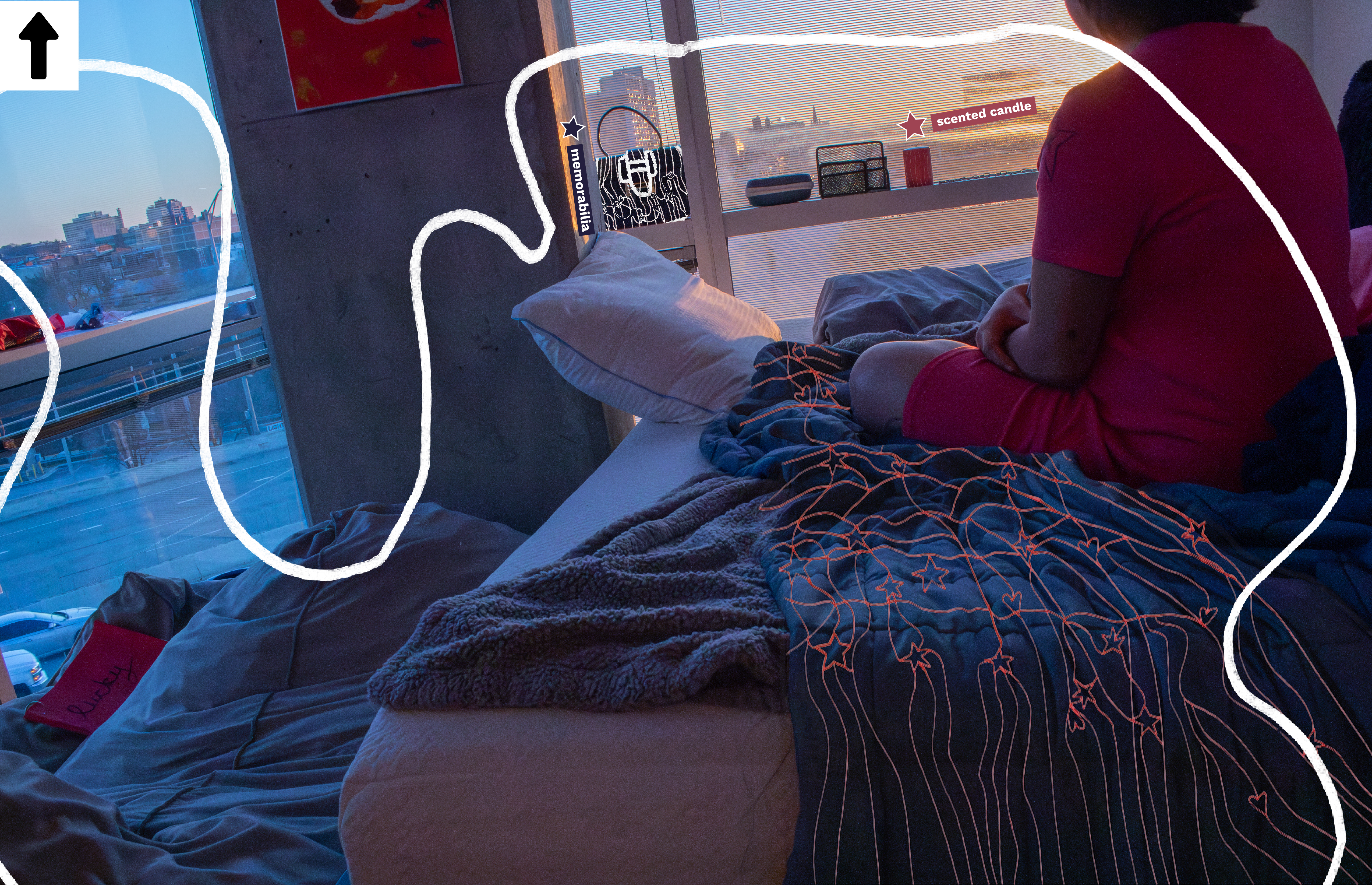

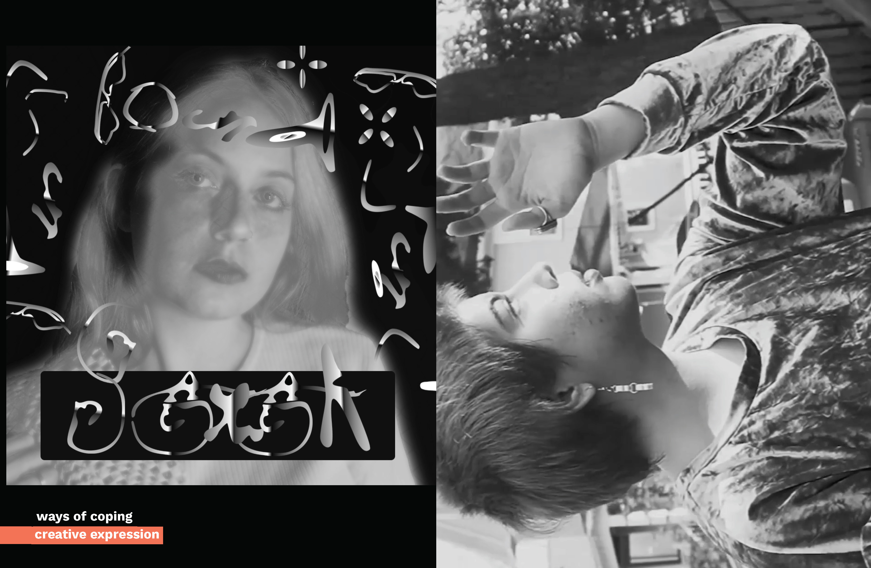
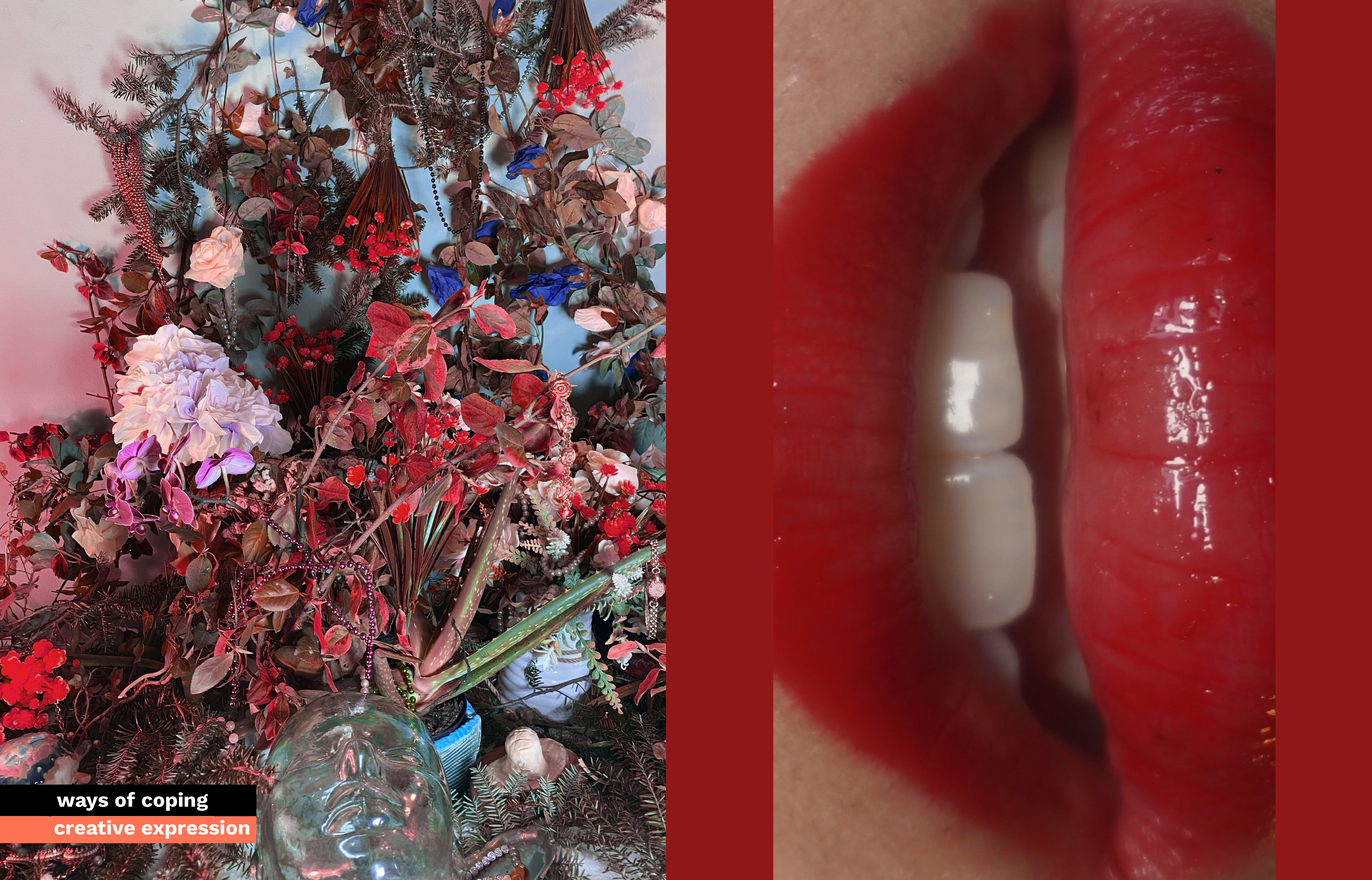



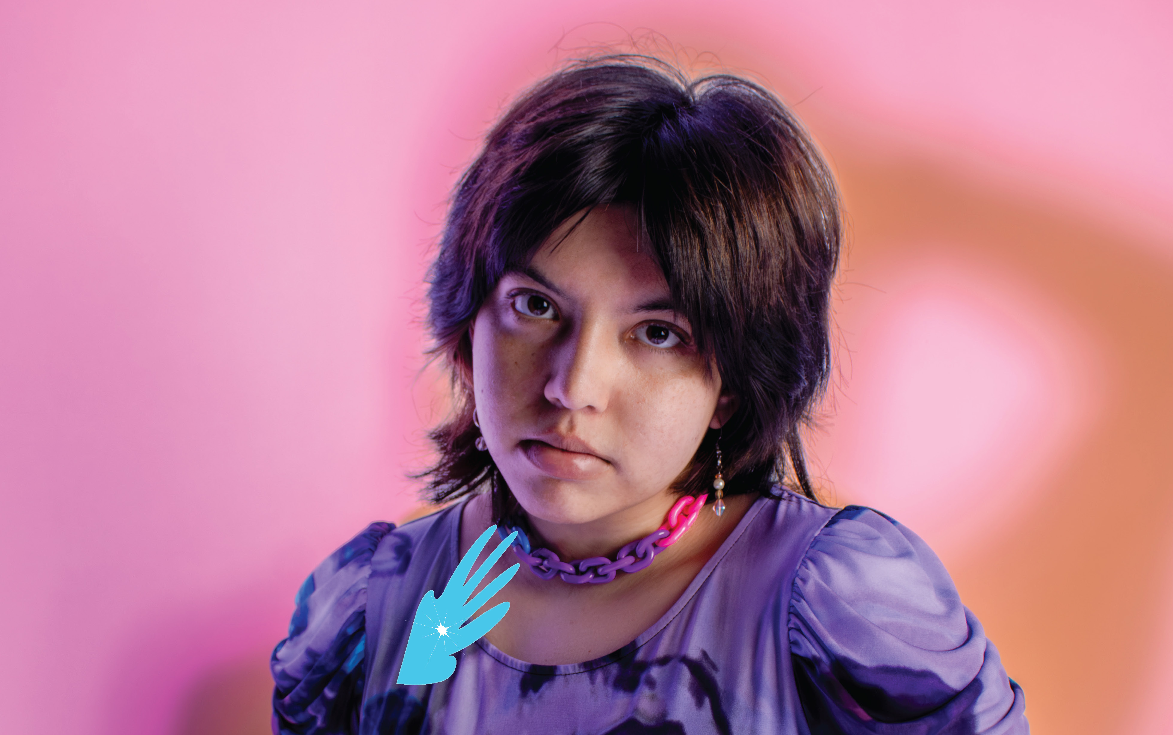
portrait photography by elio kreger
